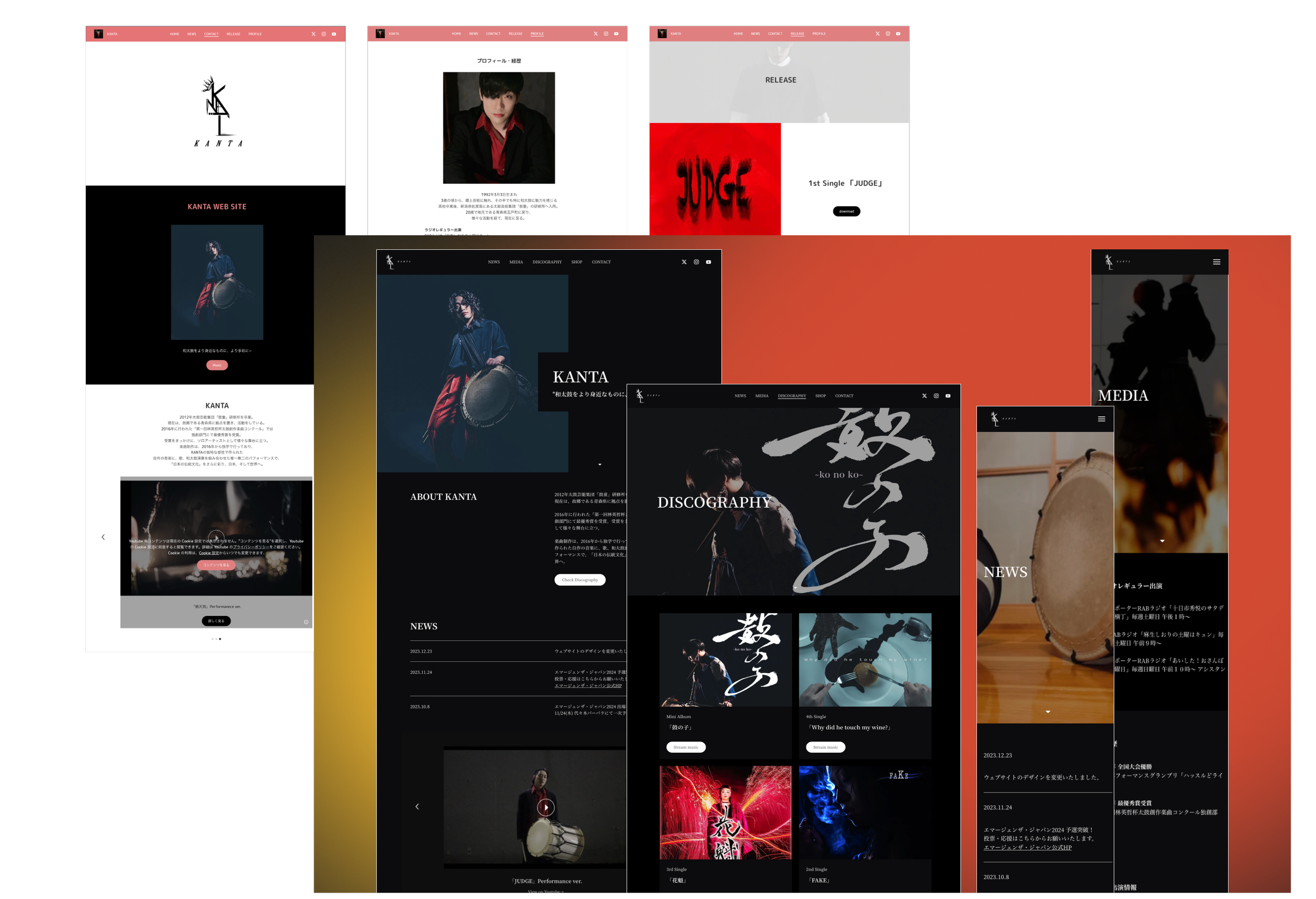
Revamping artist's site using code-free builder
The case study revolved around addressing the client's concerns about their website's inefficacy in showcasing KANTA's artistry. This involved redesigning the website using a no-code approach, redefining KANTA's branding, and optimizing content for improved usability and engagement targeted at the audience. These steps aimed to create a visually compelling platform that effectively showcased KANTA's talent and captivated visitors' interest.
Client
KANTA
Duration
Dec 2023
My Role
UI/UX Design
Team
UI/UX Designer
Tool
Figma, Google docs, JINDO(No-code website builder)
Website
https://www.kanta.website
The client
KANTA is a Japanese drum artist known for his dynamic performances and active presence across various media platforms.
OVERVIEW
Problem statement
The client-led website lacked engaging design for KANTA
The client initiated the website's development but lacked familiarity with effective website design, desiring a more visually appealing layout. Additionally, the client believed that the current design did not sufficiently captivate visitors' interest in KANTA as an artist.
Challenge
Redesign website with no-code tool limitation
Considering their familiarity with the specified budget, we continued utilizing "JINDO." I was required to create a design within the constraints of the project.
Enhance and recreate his branding
The branding required optimization to align with KANTA's image and enhance his appeal to the public.
Increase usability and readability of content for target users
Reevaluate the information architecture and site map to empower individual users in achieving their goals effectively.
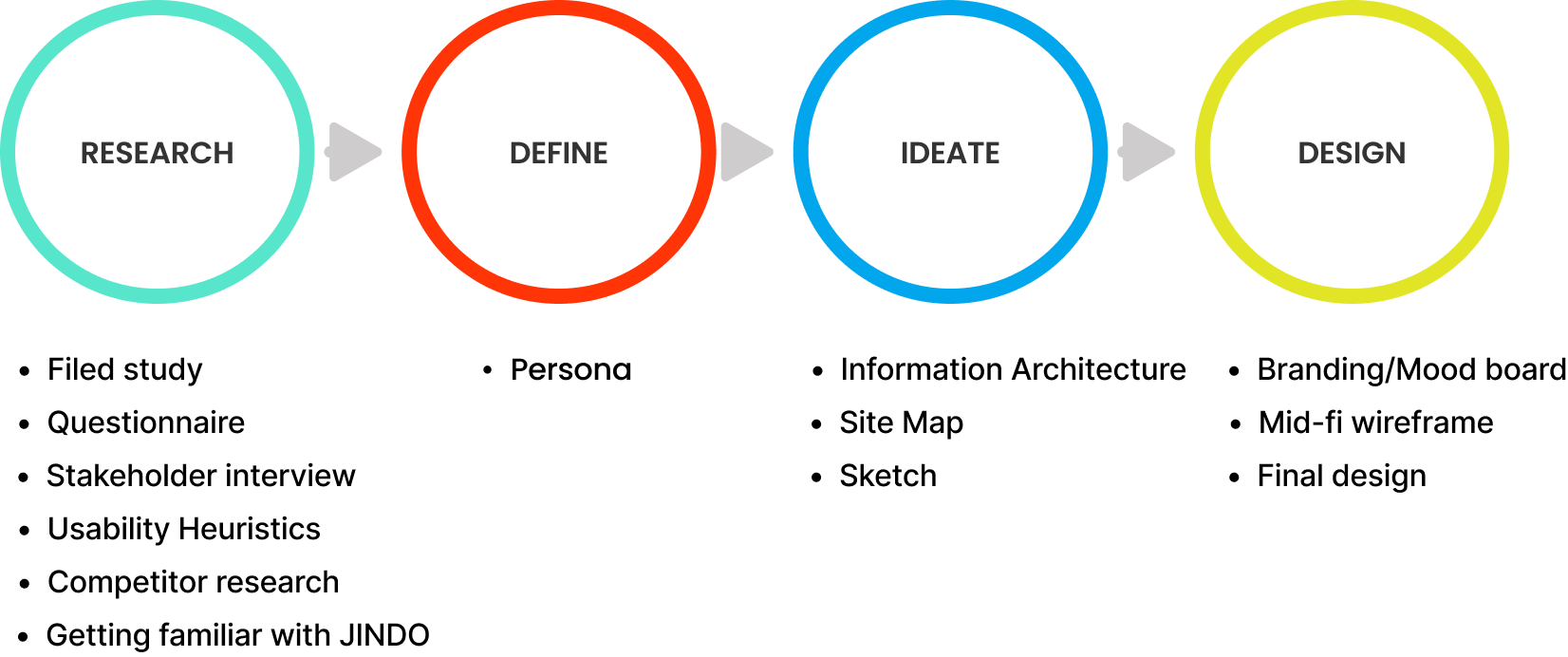
DESIGN PROCESS
RESEARCH
Field study
Experiencing KANTA's captivating performance in Japan
Yes, I got invited to his event while visiting Japan! It was an incredible experience to witness and feel the energy of his performance, providing valuable insights into the audience's reactions and the overall atmosphere.
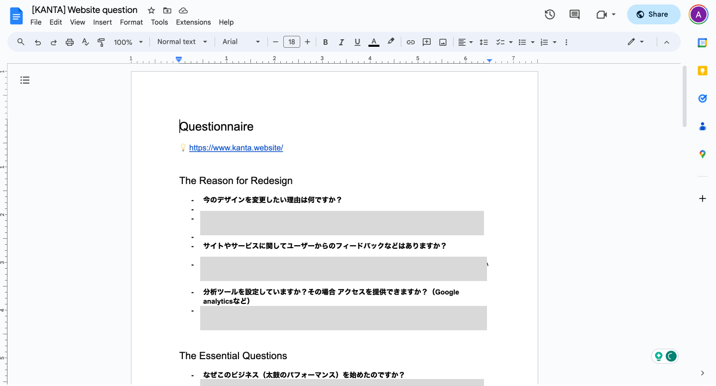
Questionnaire to the client
Pre-meeting questionnaire for exploring his business
I sent a questionnaire about their business beforehand to ensure a smoother start to our discussions, covering key aspects such as brand, competitors, and audience. Sample questions encompassed topics like:
- What is the reason behind the redesign?
- What are a few big goals you have for your business?
- Where do you see your business in 2-3 years?
- Who are your competitors?
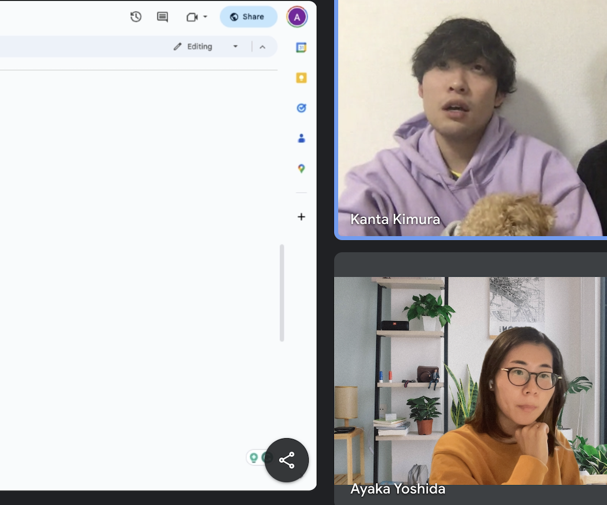
kick-off meeting - Stakeholder interview
Seeking details from questionnaire responses
I used the questionnaire responses to follow up on certain aspects, asking for more details and clarification on the information they provided.
Evaluate current site - Usability Heuristics
Major problems found in consistency and standards, aesthetic and minimalist design area
I thoroughly evaluated each of the five website pages, identifying major issues related to consistency and standards, as well as aesthetic and minimalist design.
Competitor reserch
Learned structural insights and marketing strategies
After reviewing four competitors, primarily consisting of Japanese artists such as drummers, dancers, and violinists, I expanded the scope by examining international artists, considering their goal of performing abroad. This research provided insights into the structuring of Japanese artist websites, content naming conventions, and their strategies for positioning and marketing themselves in the industry.
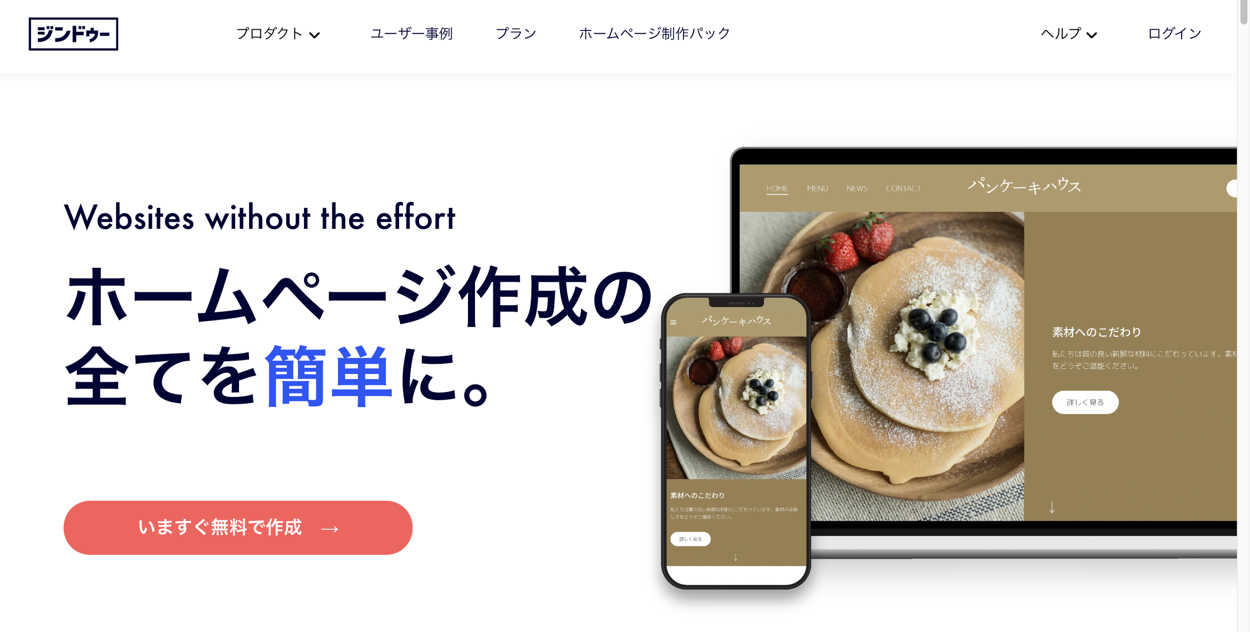
Getting familiar with no-code site builder JINDO
Assessing 'JINDO' limitations and preparing for future expansion
Considering their familiarity with the specified budget, we decided to continue utilizing "JINDO." I confirmed that they can have an English language option so that they can manage it in the future when they want to expand their business abroad. Additionally, I assessed their constraints to determine how we can enhance our approach for better decision-making in the next steps.
* Quantitative research
No Google Analytics setting… so no data
It's beneficial to have quantitative data for in-depth site analysis, yet the clients hadn't configured any analytics data. The only available data was from JINDO Analytics, but it provided insufficient insights into the site
DEFINE
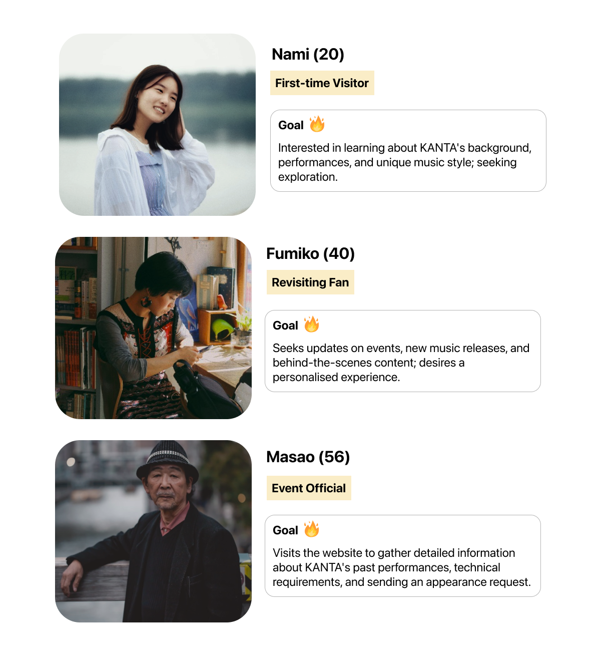
Persona
3 personas: for the first-time visitor, revisiting fan and event official
Based on the client’s information, I found out 3 types of persona visit the website.
IDEATE
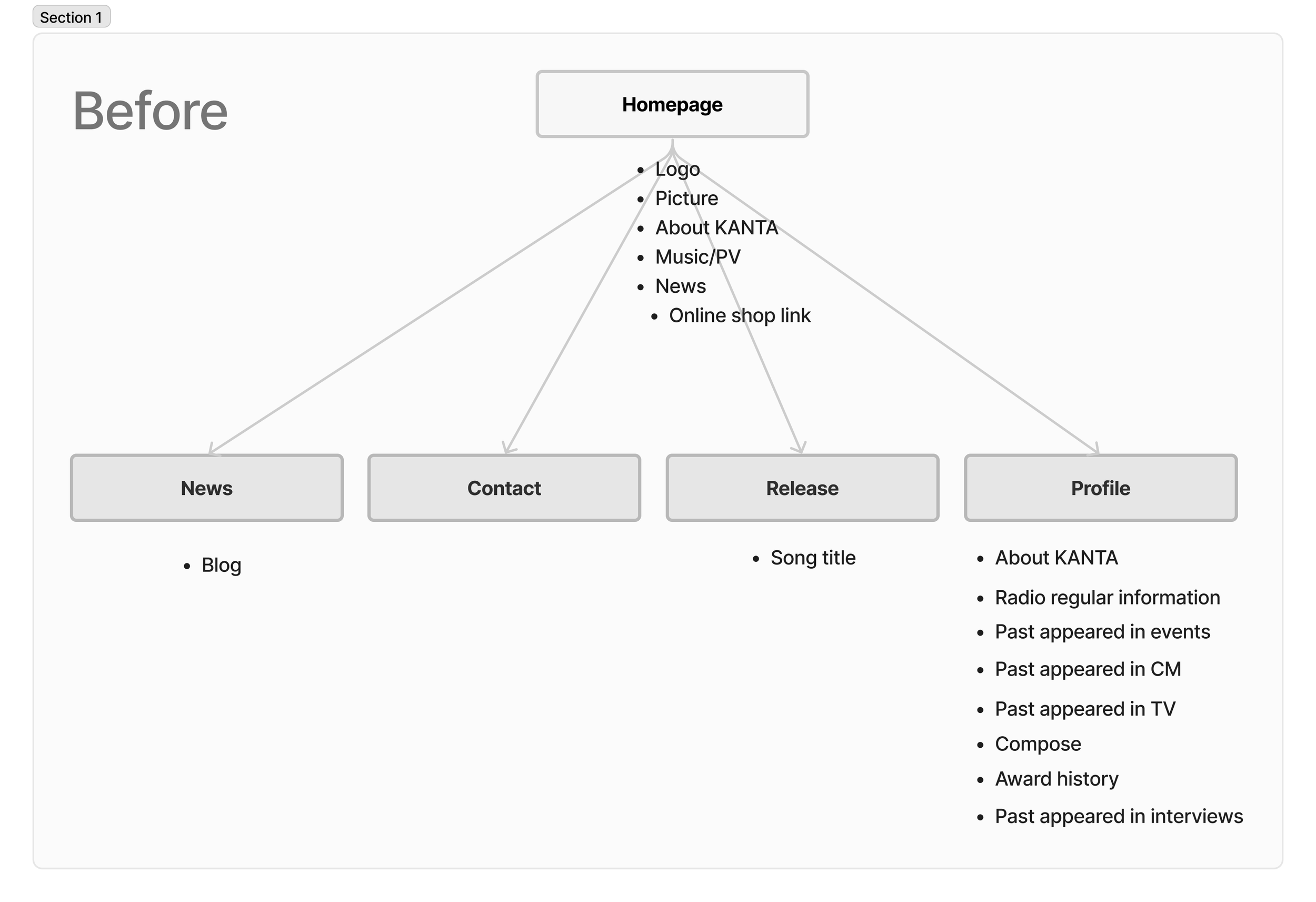
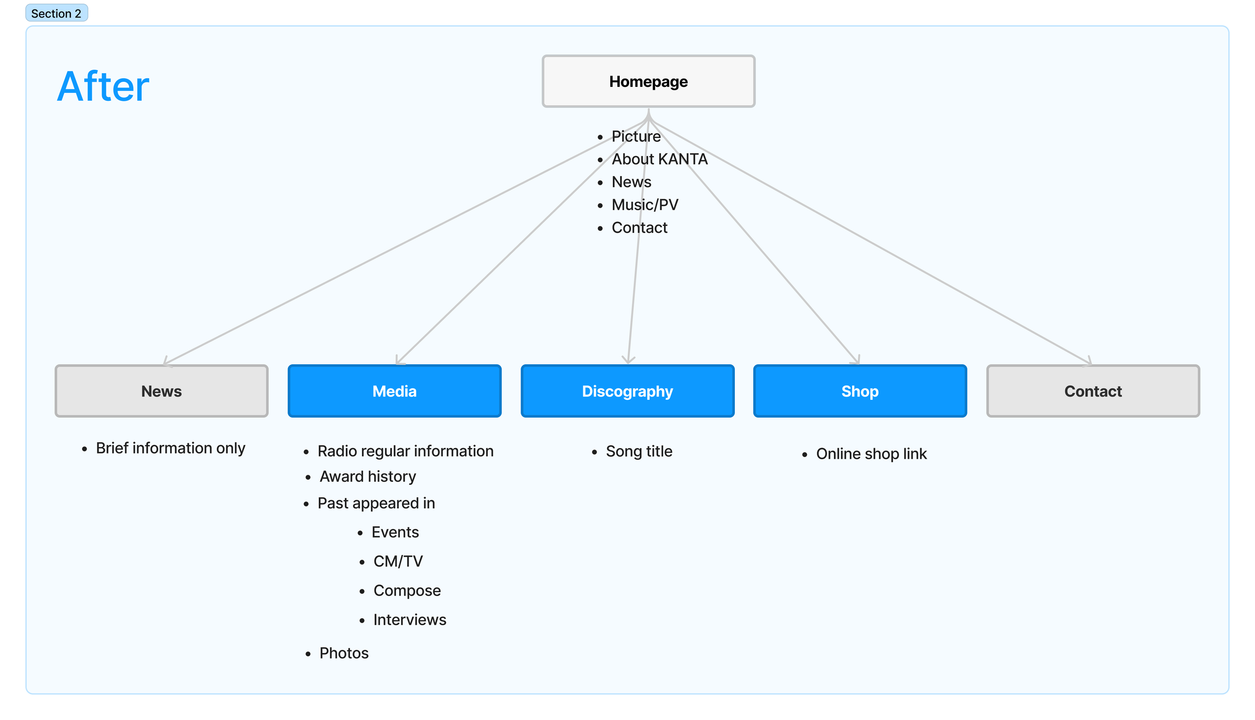
Information Architecture/Site Map
Enhanced website user experience achieved via content refinement, hierarchy organization, and structural optimization
Refined content names were aligned with industry-standard terms after reviewing competitors. The website underwent reorganization, employing progressive disclosure and a clear hierarchy to enhance user experience. Pages were optimized for ideal lengths, while the homepage was specifically designed to efficiently serve all user personas
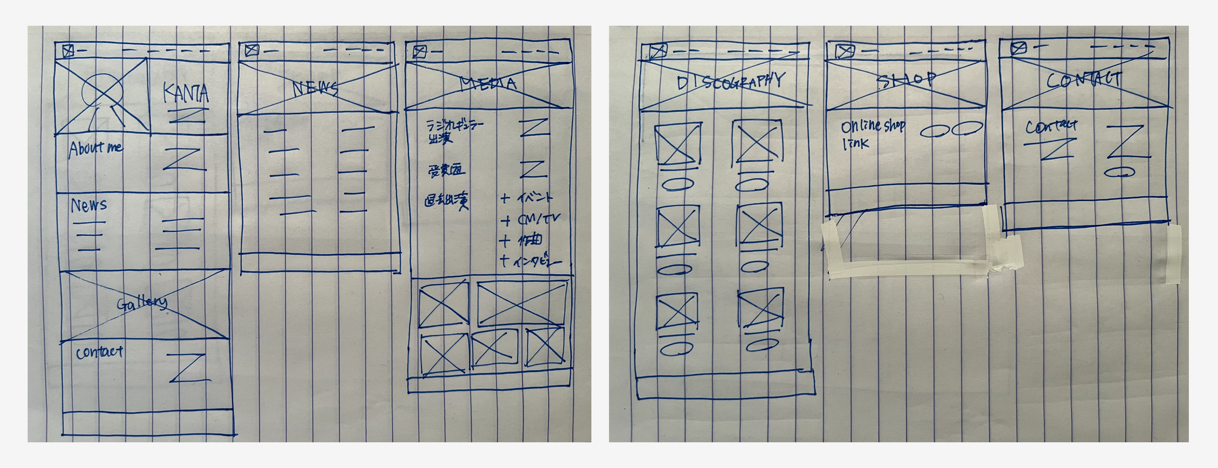
Sketch
Considering JINDO's limitations, I started designing following the IA/Site map
DESIGN
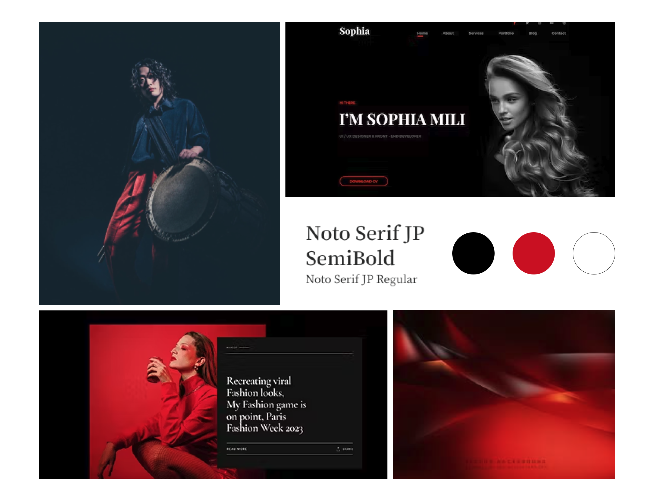
Branding/Mood board
Revamped branding with design elements reflecting KANTA's essence
They expressed a desire to maintain the existing logo but acknowledged that the current design lacked strong branding elements. Drawing from the questionnaire and our meeting discussions, I reimagined the brand by integrating specific colors, typography, and writing styles. This realignment aimed to resonate with the essence and ambiance of "KANTA," intending to captivate the audience's attention and draw them closer to the brand.
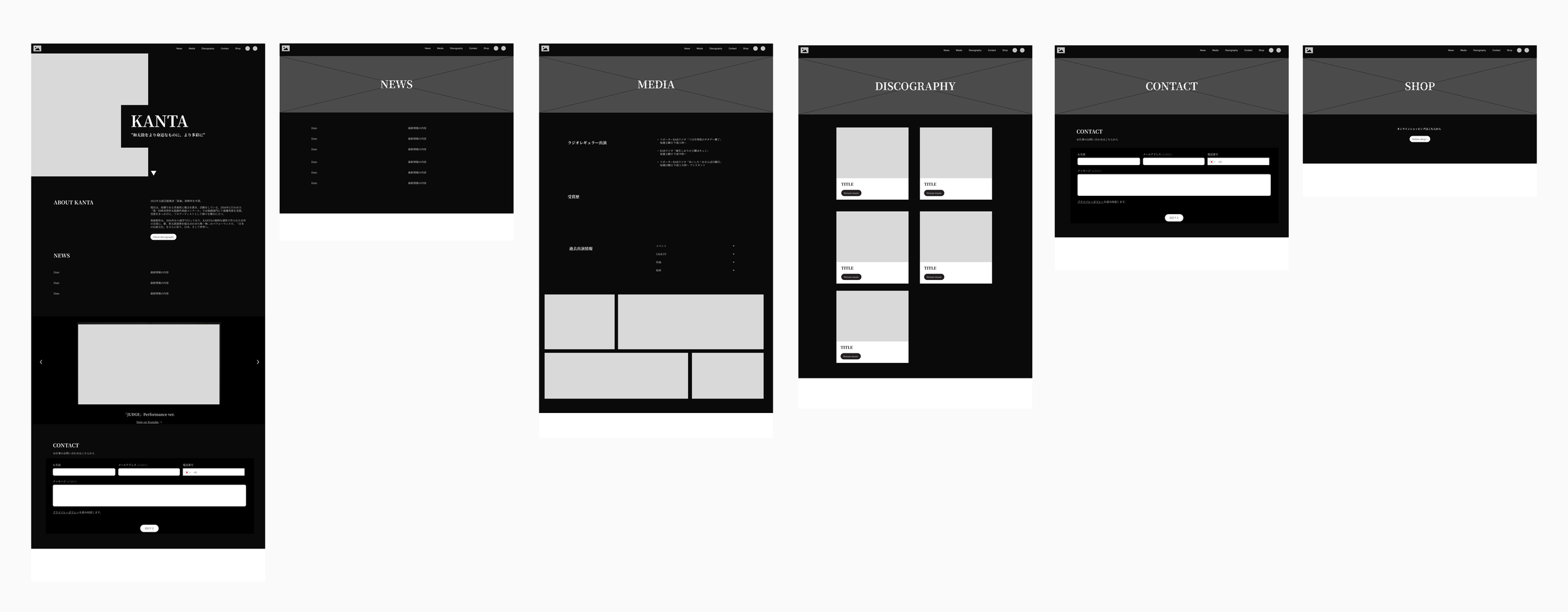
Mid-fi wireframe
Design Iteration: Due to color constraints pivot towards black-and-white styling
Based on the initial sketch, I began designing the mid-fidelity version and presented it to the client for approval. However, due to constraints, incorporating the color red into specific elements wasn't feasible. Consequently, we collectively opted to pivot towards a more black-and-white style.
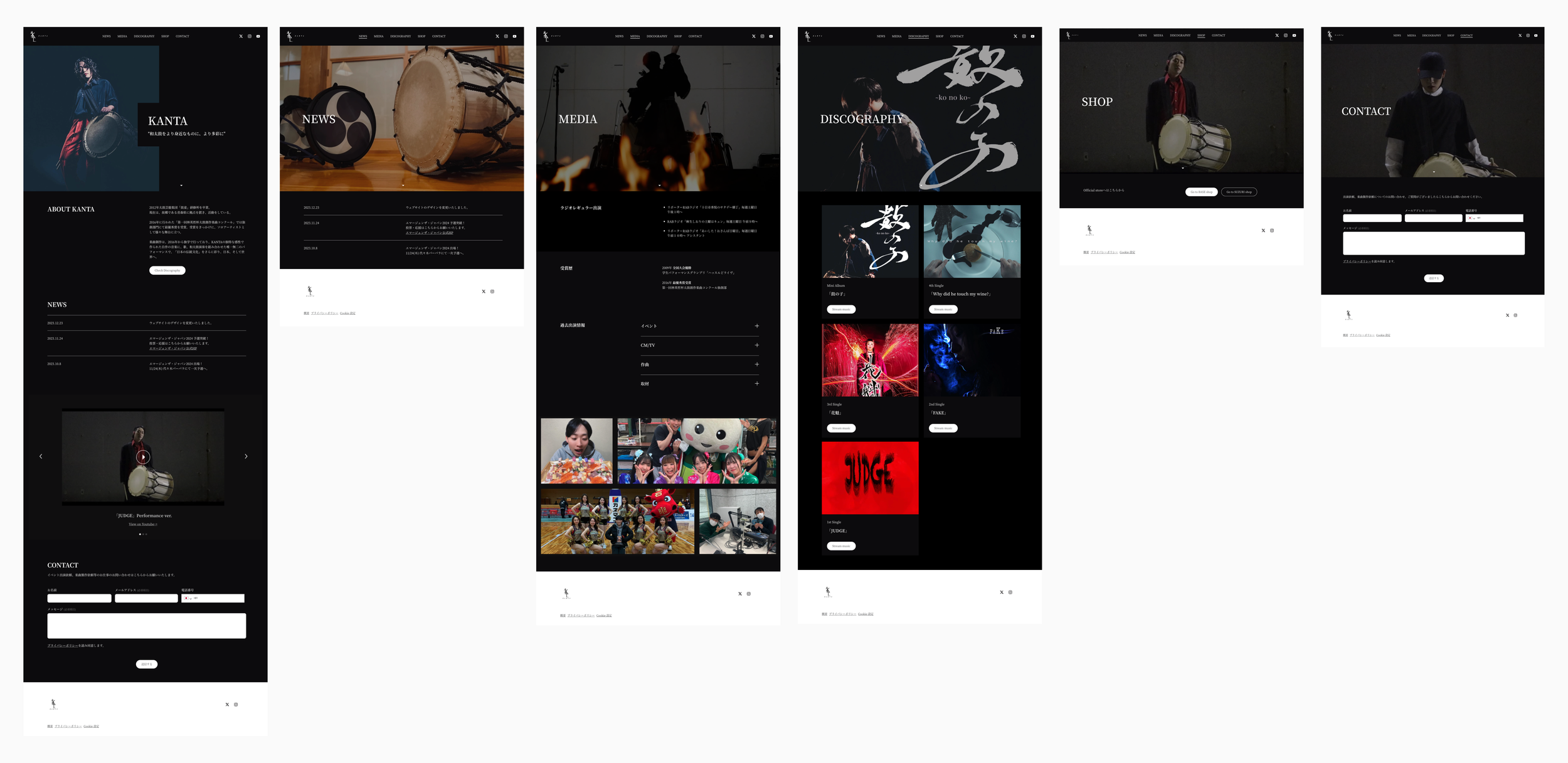
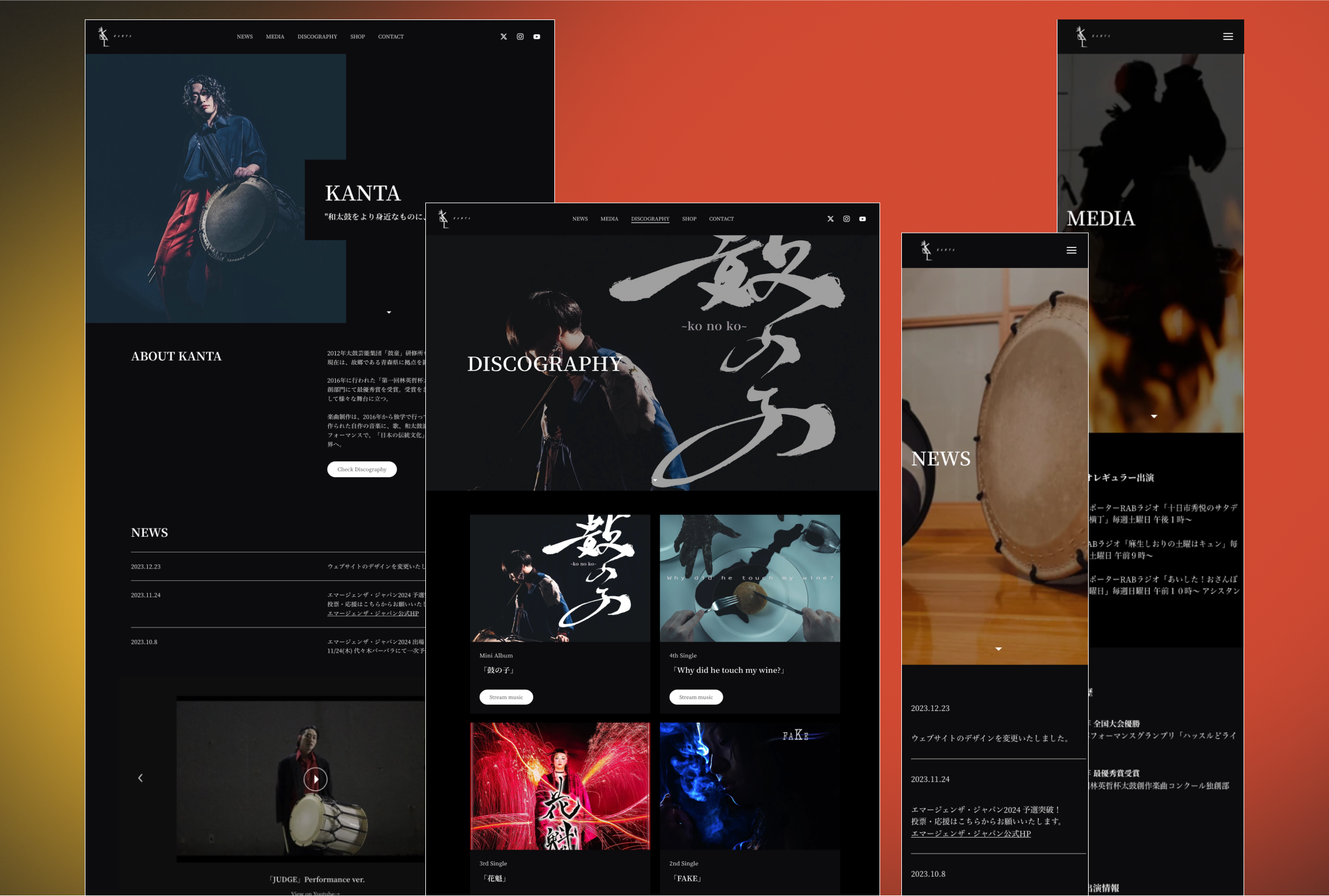
Final design
Presenting the finalized responsive design!
REFLECTION
Exploring alternative design approaches for preparedness, each no-code tool has different limitations
I discovered that certain no-code tools could not specify colors for specific elements only after initiating the design process. Encountering more limitations during the no-code design, I found it advantageous to explore and suggest alternative design directions before starting the design. This preparation ensures that both the client and I are ready and minimizes unforeseen surprises.

